Packaging
Hamdog Wine Co.
Labels and wordmark
An experienced winemaker was starting a new brand and wanted their look that spoke to a younger demographic. We utilized aesthetics more commonly seen in the craft beer scene with a wine industry spin. As the brand grew and added more varietals, we were able to keep the primary design elements to stay on-brand yet differentiate the wine types with alternate color schemes and accent patterns.


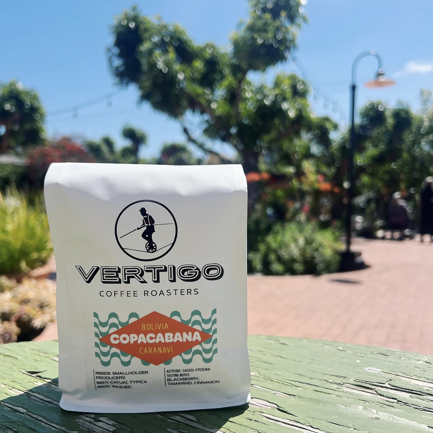
Vertigo Coffee Roasters
Bag labels
Using a combination of crisp linework, illustration, and typography, we interpreted Vertigo’s signature coffee blends by the naming convention they already had in place.
With their single origin coffees, Vertigo wanted all the details of these beans front and center. With flexibility in mind, we created a system where each continent of origin had its own color and the region was highlighted, leaving plenty of room for info about the producer, variety, process, and tasting notes.